Photo Editing for Educational Media
One of our assignments this week was to take a personal photo and “retouch or otherwise alter it in Photoshop.” That was the only direction so it really allowed for us to do whatever we wanted as long as we edited a photo in Photoshop. I am by no means a Photoshop expert, but I have become familiar with it over the past couple of years because of my work. It’s such a huge and powerful piece of software, it would take me years to completely understand all of the different things you could potentially use it for.
For this assignment, I decided to take a family photo and modify the color and add some text and images to it. Pretty easy project and nothing too complicated. The images are below:
Before

After
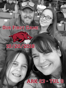
As you can see, it’s a pretty straight forward edit. These are the steps that I took to create the image on the right:
- Imported the photo into Photoshop.
- Made a copy of the Background layer to modify. This way, it’s a non-destructive process. I can always switch off the layer that has been edited.
- On the copied layer, I desaturated the color. In Photoshop, Image -> Adjustment -> Desaturate. This basically made the photo a black and white photo. The reason I did this is because I was going to use some color in the photo and wanted that color to pop.
- Next, I added a Razorback logo in the “empty” space between the four of us.
- I then framed the Razorback with text using the Freshman font. Looked fitting for a “school” or “varsity” type font.
- Then added more text in the bottom right.
- Went back and added a white stroke to all of the letters and the logo to make them pop and stand out.
- Also, added Inner Shadow to the letters (just not the logo).
And that’s it. Pretty straight forward. I didn’t run into too many obstacles in this assignment. The one issue that I did have had to do with the color adjustments on the photo. Didn’t know just HOW I wanted to do what I wanted. So, I played around with the Hue/Saturation, Color Balance, Exposure, and more. Then just hit Desaturate and BOOM, there it was. Didn’t even need to use Google to figure out this one, just trial and error playing around in the tool.
The Blending Options are what really made the difference on the text and logo layers. Putting them in there without the stroke just looked blah. Adding that little tweak made it work much better.
As far as my future use of Photoshop, I know I’ll continue using it. I actually use it quite a bit with my job. It’s such a versatile tool. I definitely plan to go through as many Lynda.com tutorials as I can. I do feel like it’s one of those tools where it would help to be a graphic designer. There are so many things that Photoshop can do that if you don’t have a designer mindset, you wouldn’t even think of using certain functions. Similar to the “I don’t know what I don’t know” mindset, but more of a “I don’t know how to do what I don’t know to do.”


Recent Comments